
Doug Eyman, in his usual style, wrote at length about visual rhetoric in his infamous textbook chapter. His usual style is, of course, impenetrable and obtuse. It doesn’t help that even he acknowledges the conflict of defining what even “visual” means. One camp firmly dies on the hill of visual rhetoric encompassing “representational images.” On the other hand, “it could include the study of the visual aspect of pretty much anything created by human hands—a building, a toaster, a written document, an article of clothing.”
Eyman argues that the latter definition causes significant overlap with the study of design. All that said and done, my understanding of digital literacy already hinges on solid visual design. Another excuse to bring up Susan Kare: her icons gave the Macintosh something of a friendly image. Even the process that led up to the Macintosh having a high-res monochrome display says something. It’s a trade-off, sure, but it gives off an air of professionalism and luxury. This wasn’t your blocky, affordable Commodore 64.
Wait, I’m onto something.
Eyman refers to Carolyn Handa when he states, “It is the question of audience and the image’s persuasive effect (rather than simply aesthetic effect) that serves as one of the foundational elements of visual rhetoric.” Besides that crispy, yummy-looking screen, it begs the question of what the Macintosh itself says to a potential buyer with about $2500 to burn. At this point, it’s important to note its success as an early all-in-one machine.
Even today, you have home computers that have the monitor, the mains, etc. as separate pieces. The Macintosh shoved the computer, the floppy drive, and monitor into a simple box. It almost feels like you’re just looking at an old television. I point that out, because I took a second look at the ill-fated Lisa. So much more horizontal space gives it the energy of cold “console” you’d find at a university in the 70s. I don’t think the giant five-megabyte hard disk it was compatible with helps.
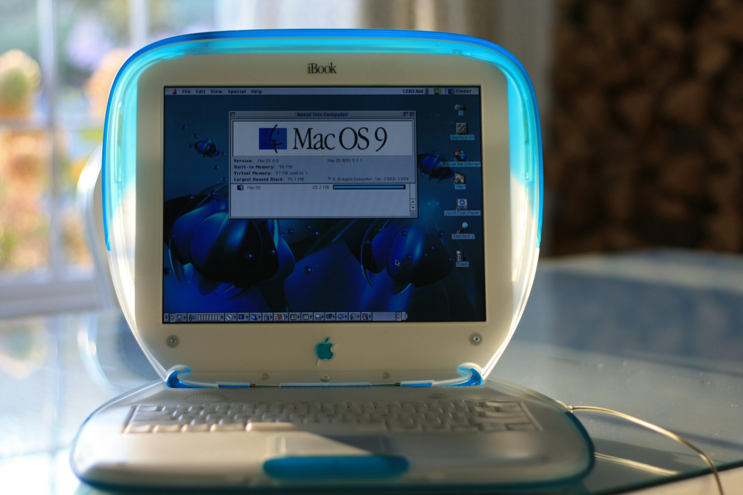
I suppose what I’m trying to say is that, in its physical appearance and in its software, the Macintosh managed to mean business. Yet, not in a way that felt alienating. You can get much different stories once you, say, look at the iMac G3. The variety of colors certainly made it “hipper” than the previous PCs by Apple. Translucency was generally “in,” too (see also: original Game Boy vs. Game Boy Color, particularly the latter’s “Atomic Purple” variant). It tied in oddly well with the mantra of the inside of a Mac looking better than the outside of a PC. It worked! They even made laptops that looked like blobjects! (pictured above)
I got all that from an outdated computer, and I was kind of just thinking about it giving off “I am listening to Bjork and wearing bell bottoms” vibes.


Leave a Reply